I decided to take designs of Soviet ads at the beginning of 20th century.
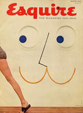
Also, I took a cover of a French magazine "Esquire". The design dates to 1960s.
Good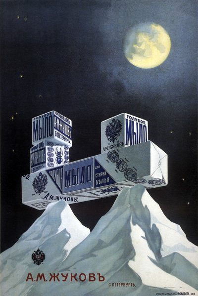
This
is the ad of a soap. I think it is a good one, as it is harmonius,
unusual - soap is placed on snowy mountains which is unexpected and
makes people associate it with snow, white, clean... The soap is
situated in the middle of a picture which makes us pay attention to it,
but at the same time this position is not very obvious, as it is in
harmony with all the other objects in the picture. At the same time the
style of the poster gives the eye a flow from the moon down to the
soap, mountains and the brand, which is wisely written with warm color
on the picture made of cold colors - this makes contrast and emphasises
the brand better.
 ...
Read more »
...
Read more »

