Information is taken from www.seosmarty.com
Color is a crucial element of a brand identity. We immediately
associate skype with blue color StumbleUpon with green, Yahoo with red. Website color
scheme can make us to leave immediately or to stay for a minute if it
looks appealing. Color evokes positive associations and thus forms initial opinion of the brand. The choice of your brand color can thus
stand for:
- your new visitors’ enrollment and participation (by attracting their attention);
- your brand awareness (by sticking into memory);
- your brand positive or negative associations (by boosting memories of what people like/dislike).
General “Color in Business” Theory:
| GROUP |
COLOR |
ASSOCIATIONS |
NATURE OF ASSOCIATIONS |
RECOMMENDED FOR |
| cool (calming) |
Blue |
secure and trustworthy |
sky (therefore universally liked) |
business related websites (e.g. banks) |
| Green |
wealth (deep green) |
money (”the color of success”) |
finance related websites (e.g. Forex related) |
| calming (light green) |
trees, spring |
entertainment and leisure related websites |
| warm (exciting) |
Red |
grabs attention and makes you energatic
(by activating your pituitary gland) |
power (e.g. red carpet) |
eye-catching logos, calls to action |
| Yellow |
optimism |
sun |
attention grabbing (esp. using it in contrast
with other color) |
| Pink |
energy (hot pink) |
feminine color |
products for young women |
| romantic (lighter pink) |
products for girls |
| Orange |
cheerful |
citrus fruit |
kids’ websites |
| neutral |
Black |
powerful |
“absence of color” |
expensive products |
| White |
simplicity and purity (catches the eye) |
numerous (from brides to hospitals) |
health related products |
[based on an article on brand colors and awesome Sensational Color blog]
Facts we should also know about colors:
- Color is a powerful promotional tool;
- Colors should be trendy and catchy (use “colors that pop”);
- Between 60% and 90% of website initial assessment is based on its color.
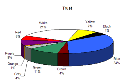
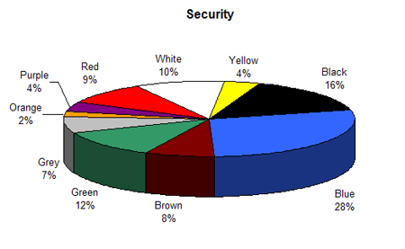
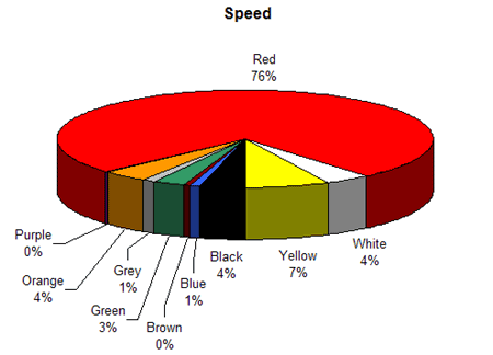
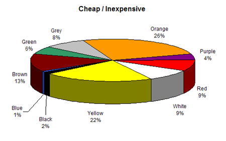
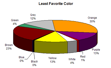
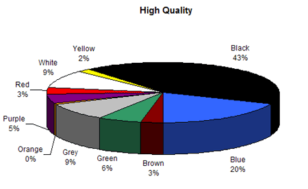
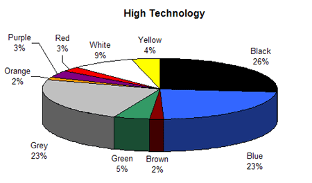
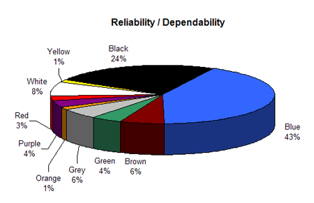
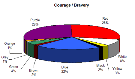
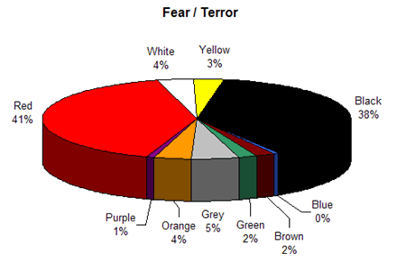
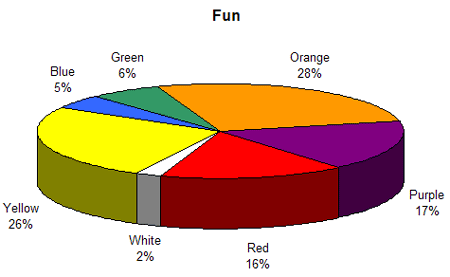
Here is also the graphical representation of how different colors are associated with different features (http://www.joehallock.com/edu/COM498/associations.html):
Color branding: geographic targeting
Color symbolism is very area specific. Color associations vary
depending on the national history, traditions and religion. Here is a
popular example demonstrating the importance of color research before
targeting a new area: when United Airlines expanded the
service to Tokyo, their brand color was white. But the company had soon
to change it to red, because in Japan, white can be associated with
death and mourning.
However not everything is that simple, even within one country one
and the same color may evoke quite opposing associations (see ‘red’
that can have both positive and negative associations of courage and
sin in the USA).
| COLOR |
East |
Europe |
| Green |
sunrise, life and growth (China)
color of eternal life (Japan)
sickness and/or nausea |
fertility and rebirth=> hope |
| Red |
expelling demons and illness (Japan)
fire =>honor, success, fortune, fertility, happiness; weddings (China) |
guilt or sin;
courage and sacrifice |
| Yellow |
royalty and respect (China) |
jaundice and cowardice in Greece and jealousy in French culture |
| Pink |
pornography (Japan) |
baby girls |
| Black |
nobility, age, and experience (Japan)
trust and high quality (China) |
mourning style and elegance |
| White |
mourning and death |
purity or innocence |
(Based on ‘Color Meanings Around the World‘ and Colour Journal)
There is no such a thing as ‘universal’ color.
Even a positive color like green (associated with Nature and growth in
most countries) may denote death in South America and countries with
dense jungle areas.
The best (and proven) way to target a specific country
is to use its national colors - that always evoke positive associations
of something familiar and trustworthy. For example, in Argentina where
beer is a very popular product, a company called Quilmes has quickly become #1 due to national color branding (compare) and a more successful Coca Colla competitor in Peru Inca Kola managed to outdo the universal monster only thanks to sticking to the country’s national palette.
Color branding: niche targeting
Color choice in your website or brand logo design may be determined
by a niche you are targeting. Again, there is no clear line between
using some specific color for a vertical worldwide. For instance,
‘red’ associated with debt and crisis in the US (e.g. it denotes a drop
in stock prices) and hence avoided in ‘finance’ niche, has quite
opposite associations in Eastern Asia where it is used to denote a rise
in stock prices.
| COLOR |
Auto/Transport |
Beauty |
Business |
Adult |
Gambling |
| Blue |
|
Yes (strong association with clean calm water) |
Yes (security) |
No (indicates lack of experience) |
No (denotes calming tranquility) |
| Green |
No (unlucky color in Europe and US) |
Yes (associated with nature, life and growth) |
Yes (association with US dollars and safety) |
|
|
| Red |
Yes (sexy, speedy, high-energy, and dynamic) |
Yes (associated with energy) |
No (associated with debt) |
Yes (denotes sexuality; e.g. red-light district) |
Yes (encourages people to take risks; also paired with yellow) |
| Yellow |
Yes (associated with taxi or a school bus) |
|
No (associated with dishonesty, cowardice,
egoism, betrayal) |
No (associated with children) |
Yes (when paired with red) |
| Pink |
Yes (cars for women) |
Yes (associated with young girls and youth) |
|
Yes (=feminine) |
|
| Black |
Yes (denotes prestige and luxury (e.g. black limousines)) |
No (associated with death) |
Yes/No (denotes prosperity, e.g. “in the black” but has some clear associations with something ‘bad’ and ‘illegal’) |
Yes (denotes sexuality) |
Yes (associated with prosperity) |
(Based on ‘color meaning article’)
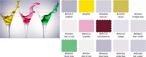
Some Fun?
| 


